We recently published a company blog post titled Manage Your Tech Career that featured a visualization of “Startup Salary & Equity Compensation” across different job functions, levels, company sizes and regions. The post received more traffic than we anticipated, and a lot of people have asked questions about the tool. Here I’d like to tell its backstory, focusing on the parts that might be interesting to others designing interactive tools or visualizations.
Diving into the Data Set
We started with a raw data set consisting of salary (2011) and cumulative equity compensation (since hire) for 8,362 employees at 135 privately held venture-funded tech companies. Both the employees and the companies were anonymized, but the data set included some important demographics, such as the employee’s region, job title, job function and job level, and the company’s sector, stage, headcount, age, revenue (2011), last valuation and shares outstanding.
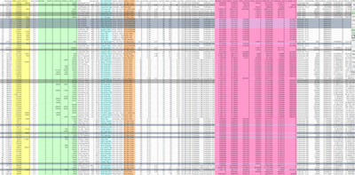 |
| Part of the raw data set. Colored columns were used in the final tool. Column groups were collapsed. Shaded rows were culled. |
A first order of business was defining useful abstractions for interpreting the data. For instance, the data set included three kinds of cash compensation (base salary, bonuses and commissions), four kinds of equity compensation (stock options, restricted stock, etc.) and ten columns of information about the company’s outstanding shares and estimated value. For simplicity, we decided to reduce each employee’s compensation to two variables: cash and stock/equity as a percentage of the company’s fully diluted shares outstanding. We opted not to estimate the dollar value of an employee’s equity because 1) we didn’t know the company’s valuation at the time of each grant and 2) a company’s future value is impossible to estimate accurately.
We then ran a regression analysis to determine which demographic factors were most predictive, so we could be sure to include them in the tool. Designing it would involve deciding which columns (factors) to include and which rows (employees), if any, to exclude.
Iterating on the First Concept
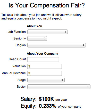 We initially wanted to build a calculator that would allow people to enter information about their current job and company and receive an estimate as to what salary and equity might be typical for someone like them. The initial ugly prototype helped us identify a number of issues:
- There were many combinations of answers for which our data set had no matching samples. We had anticipated this problem and built a prediction model to smooth the data set’s anomalies and fill its gaps. (Note: The tool we eventually published uses just the raw data, not the model.)
- A lot of people don’t know their company’s annual revenue or latest valuation. Even though every input was optional, we felt that the presence of obscure questions might dissuade people from engaging with the calculator.
- The calculator was primarily a large form. People don’t like filling out forms.
- The outputs : inputs ratio is very low. Viewers would enter 8 pieces of information and get just 2 back (or 16 if you count the incremental results). The best tools have a lot of leverage, giving a lot of interesting output without much input.
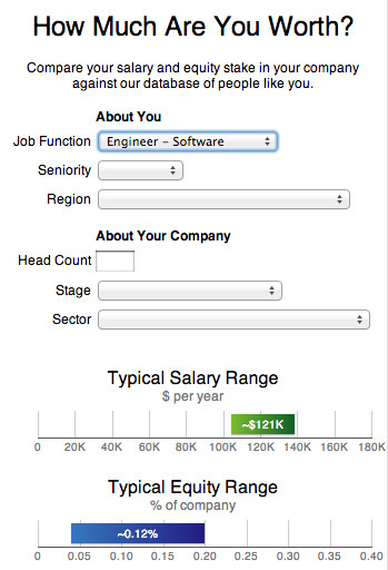 Our first stab at a graphical result conveyed a bit more information, since the bottom and top of the ranges corresponded to the 25th and 75th percentiles, but it still wasn’t enough. At this point we realized:
- Exposing very limited information also makes it hard to establish the credibility of the data set.
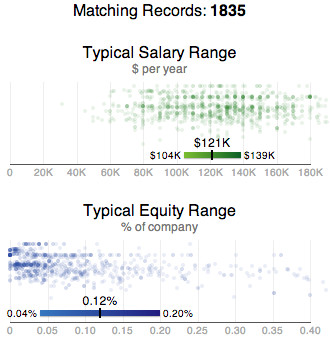 We next added a count of matching records to help convey the size of the data set. This was just a token gesture; it wasn’t actually very much more information.
For fun, I then plotted the matching samples alongside the model’s predicted range, using log(company headcount) as an unlabeled vertical dimension to spread the data points out a bit. This was more detail than our license with the data source would allow us to expose, but it was so much richer and more fun that it helped me commit to build more than a simple calculator.
Finding Stories in the Data
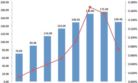
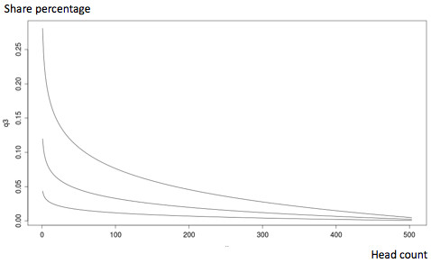
At this point we began exploring the data set again, fishing for insights that might help set the stage and establish credibility, possibly helping visitors care what our data set might have to say about them. We chose two trends that we had identified using R early on:
Excel also came in handy for quick sanity-check plots. If I were doing this again, I’d also have opened our data set in a free trial of Tableau on my Windows VM.
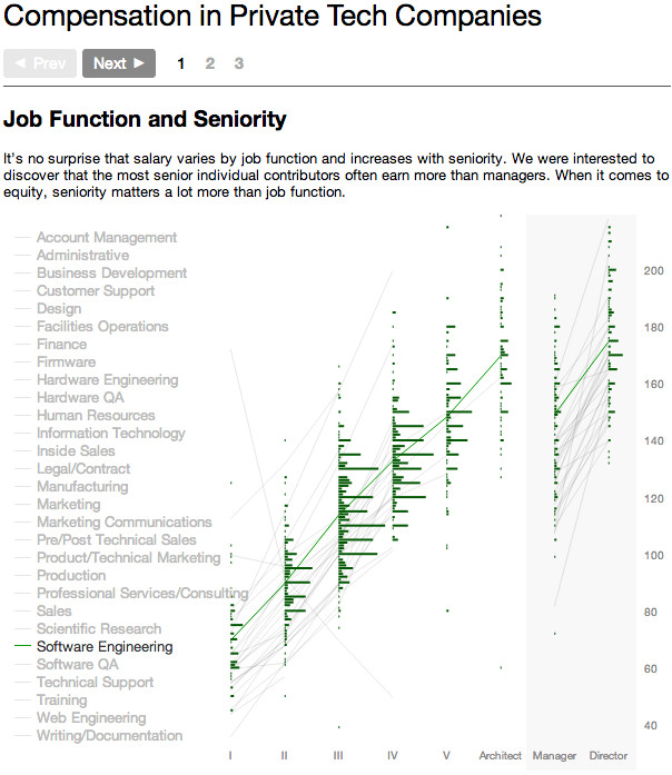 The next prototype had three steps – two to illustrate our two key insights and one for the calculator.
Before we’d gone too far down this path, we realized:
Unifying the Views
One brainstorm we had at this point was to bring the calculator back front and center, but choose a visualization for it that would also illustrate the broader insights that we wanted to convey. Stepping from one insight to the next would be a side effect of selecting a value in the calculator’s form. The chart would need to show both salary and equity compensation at once.
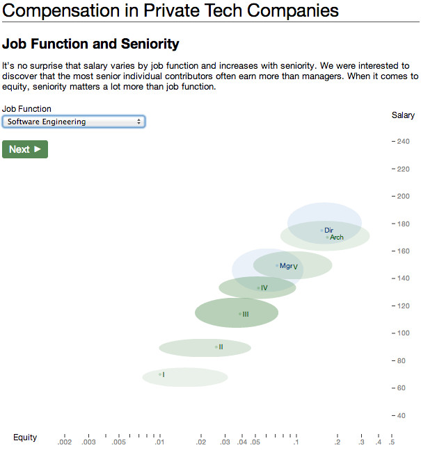 This possibility excited us because it felt simple and elegant. It worried us because we weren’t sure the points that we wanted to make could all be clearly illustrated using just one kind of chart. Even if they could, we knew that filtered subsets of the data would not exemplify the broader trends as well as the complete data set.
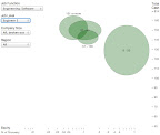 A quick prototype of the new idea quickly won me over. Career ladders were clearly identifiable. It was often clear that smaller companies gave out more equity than larger companies.
The biggest remaining issues in my mind at this point were:
Fortunately, around this time, our new designer Steve Gianakouros started. He developed a whole new look for the tool that made it more polished, unified and accessible all at once. We decided to expose all of the controls initially, giving people the freedom to explore the data set however they wanted to, confident that most people would specify criteria in the order the controls were laid out.
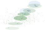 D3’s powerful transitions API made it easy and concise to have the ellipses appear, move and disappear however I wanted. Staggering certain transitions with .delay(function) helped emphasize the distinctness of certain ellipses and the relationships between others. The library’s expressiveness also encourages prototyping and sanity checking. At one point I had the raw data points comprising an ellipse’s underlying data set fade in on hover (informative, but not something we could release).
