While going over performant web animations with our new batch of interns, Netflix’s new redesign was brought up as an example of something that seemed to have DOM nodes that changed size and pushed other DOM nodes around.
From my previous blog post on Performant Web Animations, animating properties such as width or top forces the browser to recalculate the size and location of every component that may have changed, called a layout. Layouts are something you want to avoid when trying to build performant web animations. The two properties that can be animated well are opacity, and transform.
Netflix’s main hover animation has been a great example for explaining how complex animations can be built using only opacity, and transform.
Netflix built their animations by avoiding layouts and being clever with animating transform and opacity. In January, Jordanna Kwok from Netflix said:
To build our most visually-rich cinematic Netflix experience to date for the website and iOS platforms, efficient UI rendering is critical. While there are fewer hardware constraints on desktops (compared to TVs and set-top boxes), expensive operations can still compromise UI responsiveness. In particular, DOM manipulations that result in reflows and repaints are especially detrimental to user experience.
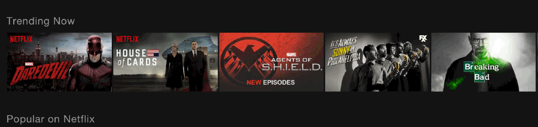
So how did they make this effect, using only transforms and opacity? There are three things happening here on hover. The hovered tile enlarges, the content changes to show a description, and the other tiles in the row move to the sides. Let’s break this effect down one piece at a time in order to understand it.
Enlarging The Tile
We have learned that the way we should make an element larger is by using transform: scale(). We can simply apply that transformation on hover. If we have an image that is 100px by 100px, and we ask the browser to grow it to 200px to 200px we will end up with a blurry image. We can solve this by using an image that is twice as large and setting it to 50% of its width at scale(1).
Changing The Content
When you hover over one of the thumbnails on Netflix, it changes the image and text appears. This is done with an overlay the same size as the parent tile that contains the new image and the description. It starts with opacity: 0 and transitions to opacity: 1 on hover.
Sliding The Rest Of The Row
This is one of the most interesting parts of their effect. Instead of letting the browser recalculate the position of every element on the page, or even just in the row that is being modified, Netflix is using JavaScript to manually move the appropriate elements in the appropriate directions using transform: translate3d().
Putting It All Together
We have all the pieces now that we need to make the effect; swapping out the content, making the tile grow, and moving its neighbors out of the way. By using an overlay and animating opacity we can swap out the content. By animating transform: scale we can make an element grow. By animating transform: translate we can move the neighbors. Once we put these effects all together, we end up with a demo just like Netflix’s effect.
Conclusion
Beautiful website UIs are using more and more subtle animations to delight the user. In order to build animations that truly feel spectacular, we need to understand how to keep the browser from doing computationally expensive operations. Layouts and repaints are particularly expensive. With this redesign Netflix has given us a great example that a little creativity can give us great experiences even when only animating transform and opacity.