When developing features at Wealthfront, it is somewhat common to receive a design mock where an entire card is clickable. One example is the account card on a client’s dashboard.
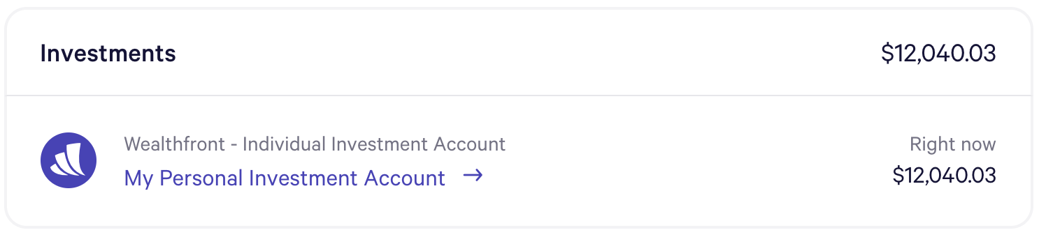
The link itself is highlighted by our purple primary text, and clicking it takes you to the corresponding Wealthfront account page. In fact, clicking anywhere on the account card takes you to this page as well.
Accessibility challenges
Adding this functionality seems pretty simple, and while we use React at Wealthfront, this can be done in a similar manner using (or not using) almost any framework. We can simply add an onClick handler to our account card div. While screen readers and tab indexes won’t be aware of this new link, that’s actually fine, since the accessible link also exists within the div. It would look something like
function AccountCard(props) {
  function handleClick(e) {
    redirect(‘account’, props.account.accountId)
  }

  return (
    <div onClick={handleClick}>
      // account card content
    </div>
  );
}
Code language: JavaScript (javascript)
However we initially experienced two challenges with this method.
- We need to add a lot of onClick handlers throughout the codebase, so it would be preferable to abstract this logic away somehow.
- We need to support clickable cards that do not have a visible nested link or button.
In the latter case, screen readers were unable to properly identify our new link.
A common but incomplete solution
Most of the example solutions we found online for these or similar problems involved adding button-like functionality to the div. For example, we could create a ClickableContainer component.
function ClickableContainer(props) {
  // ideally these are stored in a separate key mapping utility file
  const enterKey = 13;
  const spaceKey = 32;
  const { children, ariaLabel, ...otherProps } = props;

  function handleKeyDown(e) {
    if (e.keyCode === enterKey || e.keyCode === spaceKey) {
      e.preventDefault();
      props.onClick(e);
    }
  }

  return (
    <div
      onKeyDown={handleKeyDown}
      role="button"
      tabIndex="0"
      aria-label={ariaLabel}
      {...otherProps}
    >
      {children}
    </div>
  );
}
Code language: JavaScript (javascript)
By adding key handling, a tab index, a role and an aria-label, this div essentially becomes an accessible button and then we can add whatever content we want within the button. This solution works great for simple components that actually look and function like a button. Although in that case, it likely makes more sense to use the more semantic <button />.
Unfortunately, this approach is less effective with complex components. Let’s take another look at the account card component mentioned above.
If we were to make the whole card a button, screen readers would have difficulty reading its content to the user. For example, providing an aria-label, something like “My Personal Investment Account”, would result in the reader stating only that and skipping other valuable information like the current balance. Not including an aria-label would instead result in the reader stating all the content for the button at once, which could be overwhelming and unhelpful in describing the button’s purpose. In addition, this solution works only for mimicking a button. In the account card example listed above, we really want a link since we’re performing a navigation. With this approach, there doesn’t seem to be any straightforward way to capture that discrepancy.
Another potential drawback is that sometimes we have a clickable card that actually contains multiple links or buttons. For example, let’s look at another card promoting our new Autopilot feature.
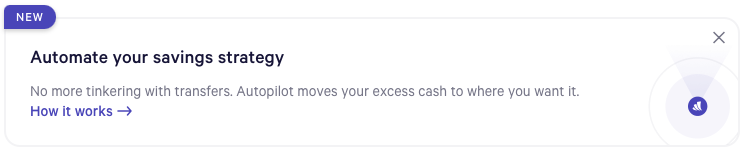
In this instance, we have the “How it works” link that takes you to the Autopilot page and clicking anywhere on the card will do the same. Anywhere, that is, except the X which dismisses the card. If we were to make this entire card a button, there would actually be no good way for a screen reader or keyboard to navigate to the close button since it would live inside of the card that would then itself behave like a button.
The accessible solution
We solved these problems by creating an ExpandedClickableArea component.
function ExpandedClickableArea(props) {
  const clickableElemTypes = ['a', 'button', 'input'];
  const refExpandedArea = useRef();

  function handleClick(e) {
    const clickableElems = [
      ...refExpandedArea.current.querySelectorAll('[data-expand-click-area]')
    ];
    if (clickableElems.length !== 1) {
      throw new Error(
        `Expected one clickable element but found ${clickableElems.length}`
      );
    }
    const clickableElem = clickableElems[0];
    const targetIsClickable = clickableElemTypes.includes(e.target.tagName.toLowerCase());

    if (clickableElem !== e.target && !targetIsClickable) {
      clickableElem.click();
    }
  }

  return (
    <div
      ref={refExpandedArea}
      className={`${props.className} ${styles.expandedClickableArea}`}
      tabIndex=”0”
      onClick={handleClick}
    >
      {props.children}
    </div>
  );
}
Code language: JavaScript (javascript)
Our ExpandedClickableArea component is still a standard <div /> and will be treated as such for accessibility purposes. But it will now look for a nested DOM node with a data-expand-click-area attribute and forward any clicks to that element. We also take some precautions here to assure that the element is in fact clickable (an a, button, or input) and that we haven’t already clicked on a link or button (since in that case, the corresponding action is already taken). This also prevents us from navigating to the Autopilot page when the X button is clicked.
But there’s still one use case we haven’t accounted for — when we have a clickable area without an explicit nested link (or button) to expand. Well there’s a simple solution for that as well. Inside the component we can simply add a link or button component and add a sr-only class. We can then add a tabIndex=”-1“ and some styling that makes the element only viewable to screen readers.
.sr-only {
  position: absolute;
  width: 1px;
  height: 1px;
  margin: -1px;
  padding: 0;
  overflow: hidden;
  clip: rect(0, 0, 0, 0);
  border: none;
}
Code language: SCSS (scss)
Even better, if you have a shared <Button /> or <Link /> component you can just add an isSrOnly prop that adds the class and tabindex for you. And then we once again have an accessible and fully functional ExpandedClickableArea component.
If this seems interesting to you, take a look at the Wealthfront careers page and come help us continue building amazing and accessible products! You can also learn more about Wealthfront, or about our new Autopilot feature discussed above.
Disclosure
This communication has been prepared solely for informational purposes only. Nothing in this communication should be construed as an offer, recommendation, or solicitation to buy or sell any security or a financial product. Any links provided to other server sites are offered as a matter of convenience and are not intended to imply that Wealthfront or its affiliates endorses, sponsors, promotes and/or is affiliated with the owners of or participants in those sites, or endorses any information contained on those sites, unless expressly stated otherwise.
Wealthfront offers a free software-based financial advice engine that delivers automated financial planning tools to help users achieve better outcomes. Investment management and advisory services are provided by Wealthfront Advisers LLC, an SEC registered investment adviser, and brokerage related products are provided by Wealthfront Brokerage LLC, a member of FINRA/SIPC.
Wealthfront, Wealthfront Advisers and Wealthfront Brokerage are wholly owned subsidiaries of Wealthfront Corporation.
© 2020 Wealthfront Corporation. All rights reserved.